OUGD501 - Study Task 1 - The Communication Model

The Shannon-Weaver Mathematical Model, 1949.

Employed by the american army, working for a telephone lab, employed to do research by the army to refine their communication systems and make them more efficient. Where communication broke down in the chain of a command, where it was breaking down and how it was breaking down. They looked into mainly radio communication. Initially limited to that, but its been tank as a communication model for the wider and social sense, visually too.

If you are going to understand any communication act, you need to understand the act of it and the process of it. Communication is more complex than that, and takes place in different mediums. Theres five stages and at each of these points interference may occur.


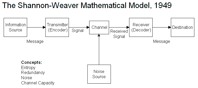
Graphic design illustrated in the Shannon-Weaver model:

Information source = Client/Brief.
Transmitter = Graphic Designer.
Channel = Design/Medium.
Receiver = Audience.
Destination = The message being communicated.


What sort of things could happen at any of these stages that could effect communication?

Information source issues could be: Client not explaining properly, or brief not being understood.
Transmitter issues could be: Designer not understanding the information/communicates it ineffectively.
Channel issues could be: Print difficulties, coding issues, distribution problems.
Receiver issues could be: Not understanding the message, not getting the message.
Destination issues could be: No interest.

Noise can happen at any step of the process. It interferes with the act of communication.

Examples of noise could be things such as illegibility, distractions, stress from above, etc. 

The Shannon-Weaver model categorised problems into three different levels.

Level A - Technical problems: How accurately can the message be transmitted?
Level B - Semantic problems: How precisely is the message conveyed?
Level C - Effectiveness problems: How effectively does the received meaning affect behaviour?

Client not explaining properly. - Level B
Brief not being understood. - Level B
Designer not understanding the information. - Level B
Designer communicates something ineffectively. - Level B
Print difficulties. - Level A - Preparing thoroughly and designing knowing of the limitations of print.
Coding issues. - Level A
Distribution problems. - Level A
Audience not understanding the message. -  Level B
Audience not getting the message. - Level B
Audience has no interest. - Level C

Redundancy vs Entropy

Redundancy: The path of least resistance, if you had a telephone line and it would communicate something 100% then it is a redundant line. In graphic design terminology it is high predictability, low information, very understandable, clear as crystal. Like a handshake, toilet symbols, etc.

Entropy: Moments of bleeding out of that channel (communication line). Very much altering a redundant form of communication slightly to be unexpected and informative. This tends to make more of an impact because it is different to generic communication that is expected.

In Graphic Design, redundancy is a tool used frequently to make information more understandable.

Task: 

Analyse a piece of visual communication using Shannon-Weaver's model. It could be graffiti, it could be an advert, it might be something from the news. Think of something interesting that there will be a lot to talk about. Look at how the communication breaks down and also the different types of problems. Redundancy and Entropy involved? 


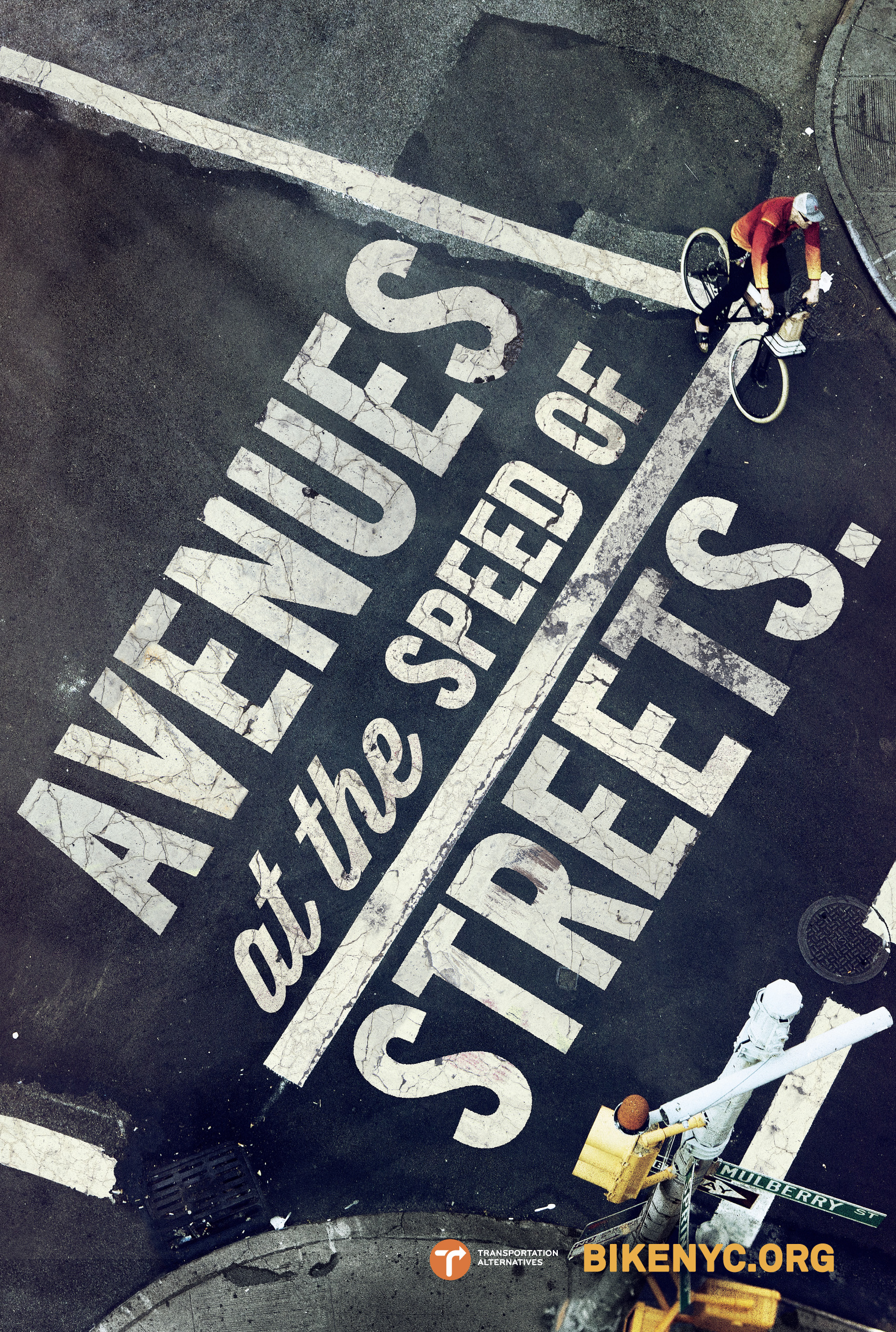
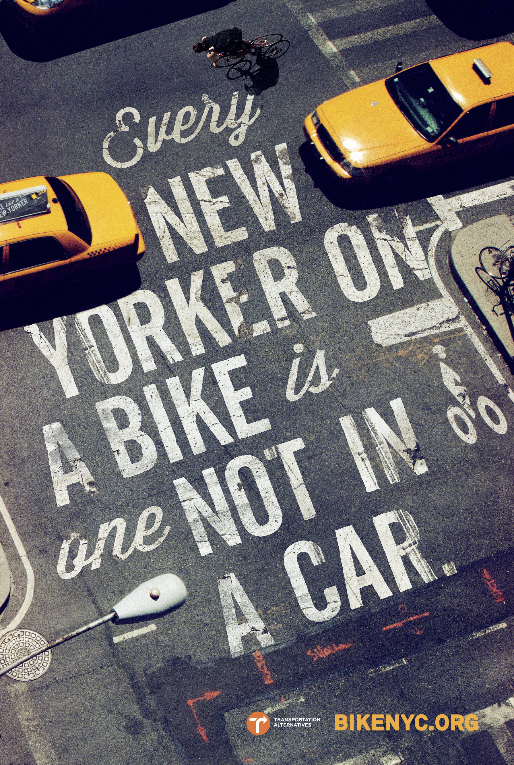
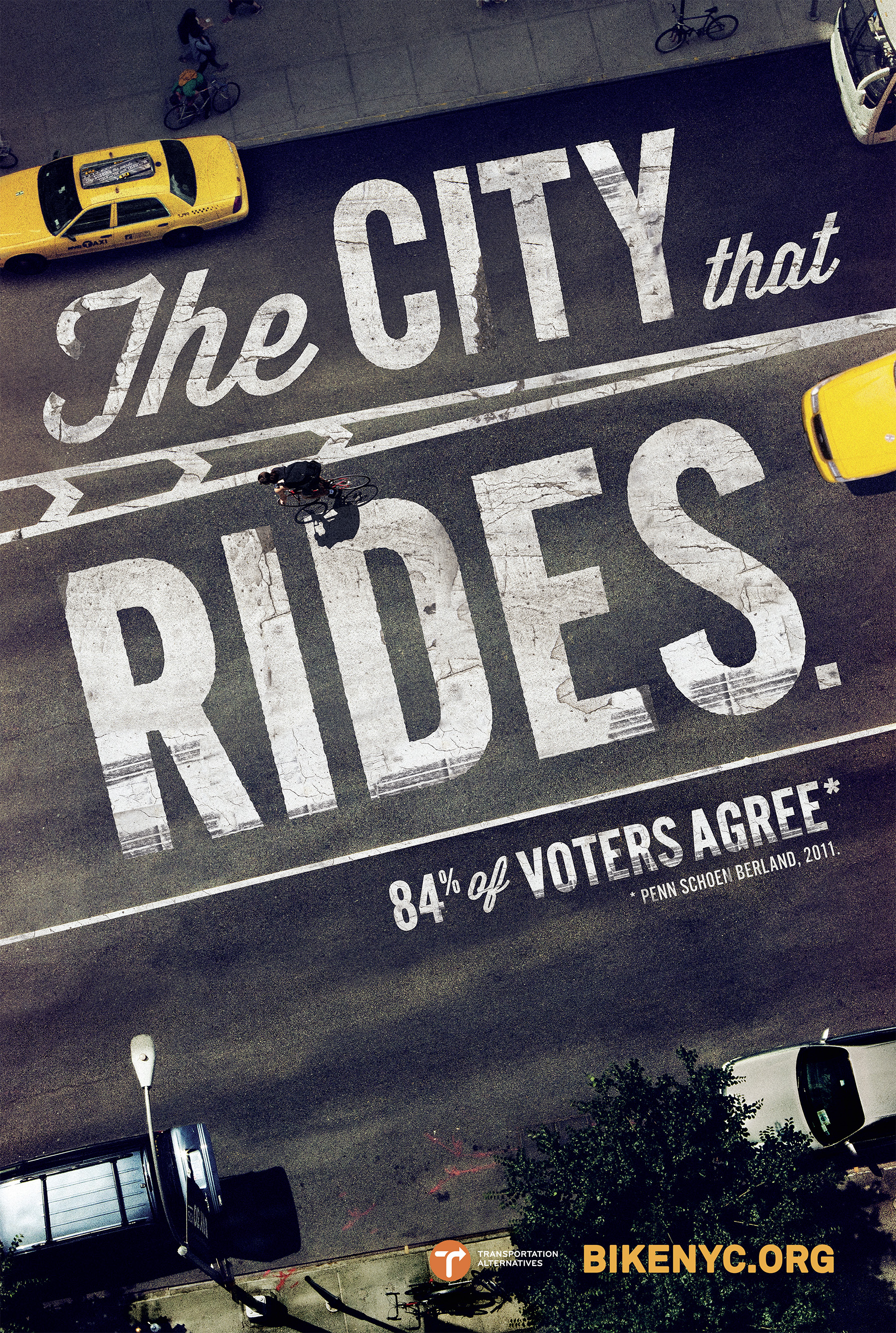
The piece of visual communication I have chosen is a poster promoting cycling in New York City. This image would be seen throughout the city on the subways, on bus stops, and near roads/traffic to get the most visibility by people going about their business in the city.
This image appears to be aimed towards people working in the city who spend a large portion of their time travelling through New York to either get home or go to work.

The way this image is communicating it's message is a very direct and personal approach to the generic New Yorker by singling him/her out on the street and specifically talking to him/her "Bike like a New Yorker". This pushes the thought into their head of becoming more involved in the culture of the city and therefore making them feel more patriotic or proud about where they are. This would also influence them to become a part of the bicycle community within the city.

In regards to the Shannon-Weaver model, each section is split into the following:

Information source - Transportation Alternatives.
Transmitter - Mother New York Marketing.
Channel - Billboards and print ads.
Receiver - Citizens of New York City.
Destination - People converting from other transportation methods to cycling within the city.

I think noise that could effect this campaign could be the following:

Noise interrupting the information source - Issues with communication between the client and the designer, the client not being clear with what is wanted, the method of contacting the designer might delay things.
Noise interrupting the transmitter - The designer not being interested in the campaign may affect the results, the designer having a negative view on cycling would create a biased project not in favour of it.
Noise interrupting the channel - graffiti ruining the billboards, the billboards being placed in quiet or constricted areas, more effective advertisements in the same place taking the focal point of passers by.
Noise interrupting the receiver - Being in a rush and not paying attention, busy traffic taking up concentration, other things on the audience's mind.
Noise interrupting the destination - People being lazy, being scared to cycle in the busy city, not enough cycle safety courses/price of them, too much to carry to and from work, or having a stubborn negative view on cycling/cyclists already.

The three different levels of problem: A, B and C are allocated to the following:


Level A - Technical problems: How accurately can the message be transmitted?
Level B - Semantic problems: How precisely is the message conveyed?
Level C - Effectiveness problems: How effectively does the received meaning affect behaviour? 

Issues with communication between the client and the designer. - B
The client not being clear with what is wanted. - B
The method of contacting the designer might delay things. - B
The designer not being interested in the campaign may affect the results. - B
The designer having a negative view on cycling would create a biased project not in favour of it. - B
Graffiti ruining the billboards. - A
The billboards being placed in quiet or constricted areas. - A
More effective advertisements in the same place taking the focal point of passers by. - C
Being in a rush and not paying attention. - C
Busy traffic taking up concentration. - C
Other things on the audience's mind. - C
People being lazy. - C
Being scared to cycle in the busy city. - C
Not enough cycle safety courses/price of them. - C
Too much to carry to and from work. - C
Having a stubborn negative view on cycling/cyclists already. - C

I think a good mixture of redundancy and entropy are used within this campaign because there are some very generic and well-known statements and aesthetics involved which everyone will fundamentally know but not think about. But at the same time a slight cheek speaking from a different perspective. This creates a humorous reminder of what happens in the city and would either make you think twice about what cyclists are doing and how to act towards them on the road, or to actually become one of them.

The rest of the images from the series are the following, these also relate to what has been said above:


Further Independent Investigation:

Overall the Shannon-Weaver model is too linear for Graphic Design and would need more aspects involved such as feedback loops and working as more of a circuit rather than a line of five different stages. Maybe I could make my own which would be more relative to Graphic design?

After learning about this model of communication, we discussed it and I came away with the opinion that it didn't best suit graphic design so I thought I'd attempt creating my own model.

In graphic design I think that before the information source, there should be a section for the reason for it, there are several other amendments I'd make to direct it firmly to graphic design. This is the model I created:

1. Message - In graphic design, it all starts with a problem, reason, idea or message to communicate. This is the obvious first stage.
2. Brief - After a message has been established, it is put into writing in the form of a brief so the designer has a clear idea of what he/she is doing.
3. Idea - After the brief has been understood, ideas should then take place. This should then be fed back to the client to be certain the right decisions are being made for them.
4. Design - When an idea is settled, design development begins with sketches and then appropriate finishing, throughout this, feedback should keep it moving in the right direction.
5. Production - The finished body of work will be prepared and produced after design has been completed and approved.
6. Distribution - However the media of this message has been created, it has to be distributed to reach it's target audiences.
7. Receiver - Inspired from the original Shannon-Weaver model, the receivers are the audience coming into contact and interacting with the work.
8. Destination - Finally, the message is identified and understood and should then cause a reaction to the audience it has come into contact with finishing the model.


This was quite interesting dissecting a widely used communication model and converting it into a model directly about graphic design. It seems to not be too bad either but I wouldn't mind any feedback in a comment if anyone sees this.

Research sources used:

OUGD401 - A Brief History of Type Finished Product and essay.


Essay:


“Advertising doesn’t sell things, all advertising does is change the way people think or feel.” – Jeremy Bullmore. Evaluate this statement with reference to selected critical theories (past and present).


In this era of globalisation and consumerism, advertising is the main control point in the competitive business world. Businesses seek to win their customers from competing rivals through the means of advertising – the main form of communication between industry and society. “Advertising is a type of communication, which is commonly defined as a process through which meaning or information is exchanged between individuals using some system of symbols, signs or behaviour.” [Arens W, Weigold M & Arens C (2010) p.8]

There are many methods and mediums of advertising but the single thing they all have in common is the fact they are all used as a communication tool, honest or misleading. Features of advertising are to make an idea or a product appear desirable through a method of visual communication with the audience. An example of a range of products deemed desirable due to the impact it’s advertising has had on consumers is Apple products. Apple uses a very clean layout when using their advertising, they are all based around a white glowing background with their product placed and complimented with a title and subheading in Helvetica weights. Clever language is used to describe their products, some examples include: “The new iMac. Performance and design. Taken right to the edge.” [See figure 1]  and “iPhone 5. The biggest thing to happen to iPhone since iPhone.” [See figure 2] These modernist design strategies are the backbone of Apple’s success and are continuing to label their products as desirable to the general market audience. Corporations and businesses help their products enter the consumers market by using advertising as a promotional tool. These tools are made to create a positive idea in the audience’s heads of their product or campaign; this is called planting a seed. Planting a seed has the objective of provoking a thought, which will then become a desire for the product itself when in the right scenario. An example of this would be McDonald’s television campaigns about their savers menus or whenever they release a new seasonal burger. Their current television advert on the McDonald’s savers menu revolves around a couple at a baby scan but the husband hasn’t turned up. They start the baby scan and he walks in to his wife looking distraught at him. He reacts to this by holding up a McDonalds bag and says “I picked up a mayo chicken burger for 99p” for her to then smile and say “Can’t argue with that” This is effective due to the humour but also as a planted seed. The next time a member of the audience is wondering around town killing time, he/she will remember that they can pick up something from the savers menu for only 99p.
A positive aspect of advertising in the eye of the consumers is choice making. Some advertisements often compare products or prices against competitors in a way to encourage people to choose their product over others. This helps the consumer save money and normally create a positive opinion of the product or company, which will benefit them in future promotions and advertisements. A perfect example of this is ASDA Supermarket’s strategy of being the cheapest out of their competitors. On almost all of their adverts they include a price comparison where it shows the price of the same product from Sainsbury’s, Tesco’s, Morrison’s and others to prove that they are the cheapest to shop at. They particularly used to aim their adverts against Tesco’s as they were deemed as the most popular out of the competitors. So ASDA’s ideology was to show consumers that they are a lot cheaper than Tesco’s to convert them into their own customers, this ended up working extremely well and ASDA’s consumer base rose dramatically as Tesco’s lowered [See figure 3].
There is always a drive behind advertising, always a “reason why”. Whether is to sell, to inform, to persuade, to create an opinion. There is always a reason for it. There is also an incredible amount of medias in which to show it. This started through the essence of print and through modern day advancements is shifting towards web and television. “At the beginning of the 20th century, Albert Lasker, who today is generally regarded as the father of modern advertising, defined advertising as “salesmanship in print, driven by a reason why.” [Arens W, Weigold M & Arens C (2010) p.8]
This essay will be a journey of critical thinking on the subject relating examples and professional statements to conclude whether the statement “Advertising doesn’t sell things, all advertising does is change the way people think or feel.” is an opinion or an obvious fact. We’ve already noted some examples of how different kinds of advertising have different aims and work to these aims by making people feel different emotions when exposed to these advertisements – This is our first clue. For the main body of this essay I am going to concentrate in a particular series of advertisements to which I hope will give me a further understanding of whether this statement is true or false.


            The idea of Santa Claus dates back as early as the fourth century in the name of Saint Nicholas. This idea is still going strong today. The shifts in cultures and identities has been expansive for this fictional character but what has built him up to be the idea of who we know him as today?
            The answer to that is advertising. Lets discuss the history of Santa Claus for a moment.
            Saint Nicholas [See figure 4] was the first known subject of this characterisation, famous for his generosity and giving attitude towards the poor or less fortunate. Portrayed as an old Greek long-bearded bishop, Saint Nicholas was highly religious from a very young age and built himself on that to make himself a better person, devoting his whole life to Christianity.
            Odin [See figure 5], the celebrator of Yule, also known as the Jólnir (Yule figure) or Langbarôr (long beard) to the Germanics was seen as the leader of the ‘Wild Hunt’, a midwinter ghostly procession in the sky. "The appearance of Santa Claus or Father Christmas, whose day is 25th of December, owes much to Odin, the old blue-hooded, cloaked, white-bearded Giftbringer of the north, who rode the midwinter sky on his eight-footed steed Sleipnir, visiting his people with gifts.” [Baker, M (2007) p.62]
            Sinterklaas [See figure 6], also known as De Goedheiligman (The Good Holy Man), or De Sint (The Saint) is a Christmas figure celebrated in the Low Countries. He is celebrated on the 5th of December (Saint Nicolas Eve) and the morning of the 6th. This character is also portrayed as an old Saint with a long beard, but Sinterklaas wears a red cape, and holds a gold crosier as well as the book of Saint Nicolas (with the names of good and bad children within it).
            Father Christmas [See figure 7], the last character of the journey before becoming Santa Claus dates back to the 16th century. This characterisation consists of a rather large man in green robes lined with fur. He represented the spirit of cheer and good health as well as luxuries such as wine, food and festivity. The feast of Saint Nicolas was put forward to the 25th to fall on Christmas day. This is where we find the character of Santa Claus.
            Santa Claus [See figure 8] is a combination of the folklore gift givers Saint Nicolas and Sinterklaas merging into the modern idea of what we think of today when we think about Christmas. However they weren’t the only things that brought to life what you are thinking of right now. As the years passed, more and more generalisations and characterisations surrounded the themed gift-giver of Christmas.
            The idea of Santa riding a sleigh with reindeer became a popular thought after a poem by Clement Clarke Moore – “A Visit From St. Nicolas: “When out on the lawn there arose such a clatter, I sprang from the bed to see what was the matter. Away to the window I flew like a flash, Tore open the shutters, and threw up the sash. The moon on the breast of the new fallen snow, Gave the luster of mid-day to objects below; When, what to my wondering eyes should appear, But a miniature sleigh, and eight tiny reindeer, With a little old driver, so lively and quick, I knew in a moment it must be St. Nick. More rapid than eagles his coursers they came, And he whistled, and shouted, and call'd them by name: "Now! Dasher, now! Dancer, now! Prancer and Vixen, On! Comet, on! Cupid, on! Donder and Blitzen;” ” – This poem has "arguably the best-known verses ever written by an American” [Burrows E & Wallace M (1999) p.462-463]  Other characterisations made in this poem push forward the evolution of who we think of today. Physical attributes made clear in the poem consist of - "chubby and plump, a right jolly old elf" with "a little round belly", that "shook when he laughed like a bowlful of jelly"
            Thomas Nast, an American illustrator from the 19th century is noted the first to put Santa Claus’ modern day image into print for the cover of a newspaper “Harper’s Weekly” in 1863. Nast is also responsible for the idea of Santa living in the North Pole [See figure 9].
            The 20th century was a good time for the development of Santa’s modern day image, which was popularised greatly through the visual idea of Santa painted by Haddon Sundblom for The Coca Cola Company in the 1930’s. Santa Claus was now being used as an advertising strategy during the holidays. Haddon Sundblom’s paintings were an iconic moment in American advertising history. The idea of using a fictional character that is associated with such a favourite time of the year by most was astounding. This campaign pushed out to the general public the idea of Santa Claus wearing red and white, having long silver hair and beard but also continuing that jolly and plump generalisation. “Appearing in publications across the country, Coca-Cola’s print ads were the first to incorporate Santa Claus. Interestingly, it was not until the mid-19th century that Santa Claus began to be portrayed in this rotund, jolly manner, and in fact, artists working for Coca-Cola played a major role in popularising the Santa Claus we know today.” [Arens W, Weigold M & Arens C (2010) p.39]  Coca-Cola was easily cementing the modern day idea of Santa Claus into the public consciousness, not only that, but also boosting their winter sales an incredible amount with the spread of print ads all over the world showing our beloved Santa drinking a bottle of Coca-Cola.
            Particularly in the mid 1900s, the post-war prosperity created a very consumerist mind-set in which people became very materialistic and dreamed of climbing that social ladder. Coca-Cola took advantage of this and made their products appear desirable to the public eye by using clever combinations of words that made it seem a must have for a hard-working person deserving of a break - “Thirst asks for nothing more” [see figure 10] and “Thanks for the pause that refreshes”. [See figure 11] Luxury was another tool Coca-Cola favoured in their print campaigns to make it so desirable to the generalised public. “Post-war prosperity of the late 1940s and early 1950s seemed to many to create a culture in which consumers tried to climb the social ladder by buying more and more modern products. A creative revolution ensued in which ads focused on product features that implied social acceptance, style, luxury, and success.” [Arens W, Weigold M & Arens C (2010) p.45]  This can be seen as a very negative aspect of Coca-Cola’s advertising campaigns. They urged audiences to go and stock up for Christmas as they were expecting guests and they needed more coca cola in the house, when really they probably wouldn’t of thought to get more in the first place. This is an example of an advertisement making people feel below average if they don’t own a certain product or enough of it, subconsciously persuading them to get more, whilst also taking advantage of the holiday season. Here are a couple of quotes I found which emphasise this problem. “Shimp (1997) identified several areas where critics contend that advertising has a negative effect on society: Advertising is untruthful and deceptive, manipulative, offensive and in bad taste; It creates and perpetuates stereotypes; It encourages people to buy things that they don’t really need; And it plays upon fears and insecurities.” [Yeshin T (2005) p.13] and “History will see advertising as one of the real evil things of our time. It is stimulating people constantly to want things, want this, want that, there is no end to it.” [Wright R (2000) p.28]
            The print ads by Coca-Cola were a series of monumental works of art, which we all remember and continue to see today. This was because of how well the medium worked with the style and mood of the message they were out to communicate. They had little catch phrases that would stick in the audience’s heads, a very child-friendly print campaign in which children would always admire the prints of the winter gift-giver of the North Pole. This is a particular reason it worked so well was the target audience of children and families. “An important influence on the media element of the mix is how well a medium works with the style or mood of the particular message. Advertising messages differ in many ways. Some are simple messages: “Just do it” (Nike). Others make emotional or sensual appeals to people’s needs and wants: “The great taste of fruit squared” (Jolly Rancher candies). Many advertisers use a reason-why approach to explain their product’s advantages: “Twice the room. Twice the comfort. Twice the value. Embassy Suites. Twice the hotel.” [Arens W, Weigold M & Arens C (2010) p.323]
            The modern-day Christmas television adverts by Coca-Cola [See figure 12] have become a traditional speculation all over the globe. Particularly in the UK the British public have grown the idea that it’s officially Christmas time as soon as the Coca-Cola adverts begin. This shows the impact of what Coca-Cola has done as a company just through advertising with the jolly bearded man.


As a conclusion to this essay, I have come to find that it wasn’t a new thing to use Santa as an advertising campaign, as a mineral water company ‘White Rock Beverages’ used it first two decades beforehand. “There’s one problem with Coke’s assertion that it created the fat, white- whiskered, red-and-white garbed Santa: The Claus that refreshes was actually introduced two decades earlier by White Rock Beverages.” [BevNET Staff (2006)] [see figure 13] This proves that the success of their advertisements wasn’t due to the fact there is an urban myth that they started the stereotype, but it was how they advertised it. It was the clever use of language, the coordinating colour scheme and the extent of the publicity.
I consider the Coca-Cola adverts some of the most successfully executed in the world mostly because of the effect they have had on the human mind, which still continues to grow. Yes, it did begin as a stolen idea in a hope to success it further than White Rock Beverages, however they did take it to a whole new level. Using ideas, stereotypes and images which are recognisable as visual communication to the generalised public, it has continued to expand and been shown in a variety of different formats.  “It is further argued that images and stereotypes used in adverts only reflect the ideas, beliefs and attitudes that already exist in society, that in fact adverts follow rather than lead social and cultural developments.” [Wright R (2000) p.28]
The best thing about the statement by Jeremy Bullmore “Advertising doesn’t sell things, all advertising does is change the way people think or feel.” Is if you split it in half and then question the meaning of that. “Advertising doesn’t sell things” If we look at it in a logical way then of course it doesn’t. It is seen to because it’s the direct communication between industry and society, however it is the industry itself that is selling things/services. And then we look at the second half “All advertising does is change the way people think or feel.” This statement here couldn’t be worded any better. Throughout the examples I have shown in this essay from different companies selling different things whether they were desirable technology from Apple or a refreshing drink of Coca-Cola, they are all changing the way you think or feel about a product. Either from no experiences of it before or a very knowledgeable view on product being advertised, it will have changed your idea of the product. In your mind it may of made you instantly want to go and find this product for yourself, or it may of planted an idea or thought in your head which will grow the more you see the product or advertisement until purchase is made.
            It might not even be a product, the same forms of advertising are used for political parties as well as charities to both inform you of an idea and give you a formed opinion on it (particularly in a positive interest) as well as a built attitude about a cause or idea in which they are working on. “Much ‘cause’ advertising attempts to persuade consumers to alter their attitudes towards a particular issue. Political parties use this form of advertising, especially during the run up to an election, to persuade the audience that their policies are the most appropriate and to motivate them to vote for a particular party. Similarly, charities often attempt to focus attention on a specific concern.” [Yeshin T (2005) p.9-10]

Overall, the summary of my conclusion to this essay ends here and after the research I have committed and the opinions I have made during the creation of this essay I can safely say that Jeremy Bullmore’s statement “Advertising doesn’t sell things, all advertising does is change the way people think or feel.” Is absolutely right. Advertisements are constantly changing the way you think or feel towards an idea or a product. It is what they have always been made for since the very beginning, and I don’t think that will ever change.


Fig 1

Fig 2

Fig 3

Fig 4

Fig 5

Fig 6

Fig 7

Fig 8

Fig 9

Fig 10

Fig 11

Fig 12

Fig 13


Arens W, Weigold M & Arens C (2010) Contemporary Advertising, 13th Edition, McGraw-Hill Higher Education, page 8:
“At the beginning of the 20th century, Albert Lasker, who today is generally regarded as the father of modern advertising, defined advertising as “salesmanship in print, driven by a reason why.”

Arens W, Weigold M & Arens C (2010) Contemporary Advertising, 13th Edition, McGraw-Hill Higher Education, page 8:
 “Advertising is a type of communication, which is commonly defined as a process through which meaning or information is exchanged between individuals using some system of symbols, signs or behaviour.”

Arens W, Weigold M & Arens C (2010) Contemporary Advertising, 13th Edition, McGraw-Hill Higher Education, page 39:
 “Appearing in publications across the country, Coca-Cola’s print ads were the first to incorporate Santa Claus. Interestingly, it was not until the mid-19th century that Santa Claus began to be portrayed in this rotund, jolly manner, and in fact, artists working for Coca-Cola played a major role in popularising the Santa Claus we know today.”

Arens W, Weigold M & Arens C (2010) Contemporary Advertising, 13th Edition, McGraw-Hill Higher Education, page 45:
 “Postwar prosperity of the late 1940s and early 1950s seemed to many to create a culture in which consumers tried to climb the social ladder by buying more and more modern products. A creative revolution ensued in which ads focused on product features that implied social acceptance, style, luxury, and success.”

Arens W, Weigold M & Arens C (2010) Contemporary Advertising, 13th Edition, McGraw-Hill Higher Education, page 323:
 “An important influence on the media element of the mix is how well a medium works with the style or mood of the particular message. Advertising messages differ in many ways. Some are simple messages: “Just do it” (Nike). Others make emotional or sensual appeals to people’s needs and wants: “The great taste of fruit squared” (Jolly Rancher candies). Many advertisers use a reason-why approach to explain their product’s advantages: “Twice the room. Twice the comfort. Twice the value. Embassy Suites. Twice the hotel.”

Baker, M (2007) Discovering Christmas Customs and Folklore: A Guide to Seasonal Rites Throughout the World, Osprey Publishing, page 62:
"The appearance of Santa Claus or Father Christmas, whose day is 25th of December, owes much to Odin, the old blue-hooded, cloaked, white-bearded Giftbringer of the north, who rode the midwinter sky on his eight-footed steed Sleipnir, visiting his people with gifts.”

BevNET Staff (2006) ‘Coca-Cola’s Santa Claus: Not The Real Thing!’ (Internet) Watertown, MA, Available from <http://www.bevnet.com/news/2006/12-18-2006-white_rock_coke_santa_claus.asp> (Accessed on 24/01/2013)
“There’s one problem with Coke’s assertion that it created the fat, white- whiskered, red-and-white garbed Santa: The Claus that refreshes was actually introduced two decades earlier by White Rock Beverages.”

Burrows E & Wallace M (1999) Gotham: A History of New York City to 1898, New York, Oxford University Press, pages 462-463:
"arguably the best-known verses ever written by an American"

Wright R (2000) Advertising, 2nd Edition, Pearson Education, page 28:
“History will see advertising as one of the real evil things of our time. It is stimulating people constantly to want things, want this, want that, there is no end to it.” – Malcolm Muggeridge.

Wright R (2000) Advertising, 2nd Edition, Pearson Education, page 29:
 “It is further argued that images and stereotypes used in adverts only reflect the ideas, beliefs and attitudes that already exist in society, that in fact adverts follow rather than lead social and cultural developments.”

Yeshin T (2005) Advertising, 1st Edition, Cengage Learning EMEA, pages 9-10:
“Much ‘cause’ advertising attempts to persuade consumers to alter their attitudes towards a particular issue. Political parties use this form of advertising, especially during the run up to an election, to persuade the audience that their policies are the most appropriate and to motivate them to vote for a particular party. Similarly, charities often attempt to focus attention on a specific concern.”

Yeshin T (2005) Advertising, 1st Edition, Cengage Learning EMEA, page 13:
 “Shimp (1997) identified several areas where critics contend that advertising has a negative effect on society: Advertising is untruthful and deceptive, manipulative, offensive and in bad taste; It creates and perpetuates stereotypes; It encourages people to buy things that they don’t really need; And it plays upon fears and insecurities.”


Copyright 2010. All rights reserved.