
First thing I wanted to do was find out the font information for the current branding of Purdey's.

What Font Is told me that the 'Purdey's' font is Futura Medium Condensed.

That the 'Rejuvinate' font is Gill Sans.

And that 'Multivitamin Fruit Drink' font is Sweet Sans Pro Medium.
I looked at other designs of coated bottles to have an idea of what others were doing.


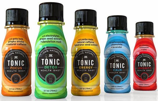
At the same time as this I thought I'd have a look at other health drinks packaging to inspect materials, print methods, wraps and caps too.


The first one I uploaded, AM + PM drinks have been coated in the way I was thinking about.
I realised afterwards that the material in which a drink is packaged affects the perceived taste, i wanted to make sure of this by reading around. I found the answer in the coca cola website as it was a FAQ on their page, they say even though the manufacturing process is identical, it does seem to taste different from different packaging. As Purdey's has always been in glass, it would be silly to change the material so this was changed back from plastic.

One thing I noticed about all of the above health drinks is how colourful they are, this definitely provokes a sense of health and revitalised feelings. The colour must be the predominant surface area of the packaging.
Bottle shapes are a very important aspect of the design so I thought I'd look at some interesting bottles and decide whether they would attract me or put me off.


The shapes of the beer and milk bottles fascinated me most. I pictured one being used for a generic drink and it would be out of the ordinary and appealing to someone looking for something different, which, in affect is everyone.
Leave your comment